7 UX mistakes that slow down every software application
Most usability problems don't come from ugly interfaces — they come from design decisions that ignore the way people actually work.
- Published on
- 03/06/2026
- Reading Time
- 8 min
- Written by
- Flaviano Arbia
When a software application isn't working well, the first instinct is almost always technical: bugs to fix, performance to tune, features to add. But the real problem is usually somewhere else. People abandon a tool, misuse it, or resist adoption — not because it's broken, but because it wasn't designed for them.
The UX of a management system, an internal portal, or a B2B platform isn't an aesthetic problem. It's an operational one. A confusing interface slows down every single action — repeated a hundred times a day, by every member of the team. The costs accumulate silently, until they become impossible to ignore.
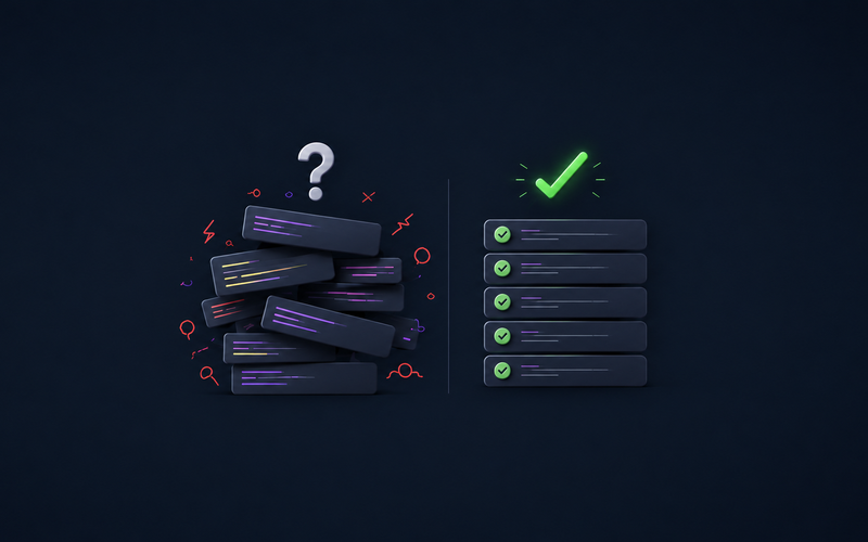
These are the 7 most common — and most expensive — UX mistakes found in software applications. Some are subtle. Almost all are avoidable.
A hard-to-use interface isn't just frustrating — it's an operational cost you pay every single day.
Ambiguous navigation: users never know where they are
In complex software, navigation is the first thing to break. Multi-level nested menus, generic labels like "Management" or "Settings" containing dozens of unrelated items, breadcrumbs that are missing or not clickable. The user opens the application and the first question they ask is: where do I even start?
The issue isn't the number of features — it's the lack of a clear hierarchy. When there's no coherent mental model guiding the menu structure, every section becomes a maze. Users learn to navigate by trial and error, and that wasted time repeats every single time they log in.
The solution isn't always brutal simplification: sometimes enterprise software genuinely needs to be complex. The solution is making that complexity navigable: progressive disclosure, contextual shortcuts, global search, and always-visible location indicators.
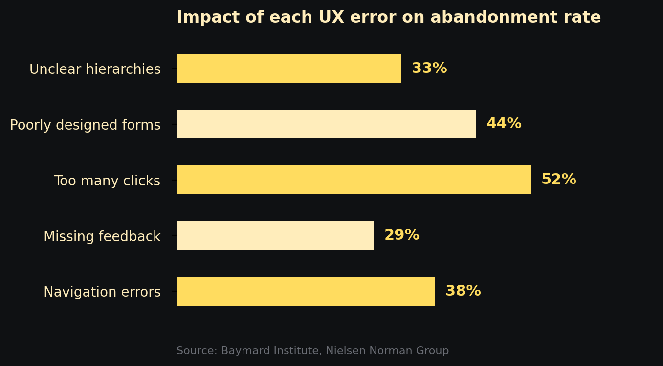
Impact of the main UX errors on flow abandonment rate — Baymard Institute, Nielsen Norman Group
No feedback: users don't know if anything happened
You press a button. Nothing visibly changes. You press it again. Maybe you just created two identical records, maybe the system was waiting. You don't know. You wait. Then you try reloading the page and hope for the best.
Immediate feedback is one of the most fundamental principles of human-computer interaction — and one of the most frequently violated. Every meaningful action must have a visible response: confirmation, loading state, error, progress. Without feedback, the interface becomes a black box and users lose trust in the system.
This applies to micro-interactions (clicks, hover, focus) as much as to macro-operations (saving, processing, submitting). A simple spinner isn't enough if it doesn't communicate how long is left. A generic success notification isn't enough if it doesn't say what succeeded. Feedback must be specific, timely, and proportionate to the importance of the action.
Too many clicks for frequent actions
Analysing user flows almost always reveals the same pattern: the most common actions require too many steps. Approving a request takes six screens. Generating a report means navigating across three different sections, selecting scattered filters, then hunting for an export button buried in a dropdown.
What seems like a logical flow to whoever designed the system becomes daily friction for whoever uses it. Click count isn't an aesthetic metric — it's a productivity metric. If a task repeated a hundred times a day requires two more clicks than necessary, you're handing hours of work to the interface every single week.
The solution starts with analysing real jobs to be done: what are the ten things users do 80% of the time? Those must be reachable in one or two clicks, visible without scrolling, and optimised for repetition. Everything else can live wherever it wants.
The most-used features must be the fastest to reach. Always. No exceptions.
Poorly designed forms: unnecessary fields, punishing validation, zero guidance
Forms are the point of maximum friction in any application. They're the moment when users stop observing and start doing — and every obstacle is felt immediately. The most common mistakes fall into three categories.
Too many required fields. Every extra field reduces completion rates. If a piece of information isn't strictly necessary at that point in the flow, it shouldn't be mandatory. The principle is simple: only ask for what you need right now.
Punishing and delayed validation. Flagging errors only after submission — with generic messages like "Invalid format" without indicating which field or why — is one of the most frustrating patterns across the entire UX spectrum. Validation should be inline, real-time, with messages that explain how to fix the error, not just that it exists.
No contextual guidance. Placeholders like "Enter here" disappear the moment the user starts typing. No tooltips on technical or ambiguous fields. No indication of the expected format. In a professional application, inline guidance isn't optional — it's part of the interface.
Missing or inconsistent visual hierarchy
In an interface without visual hierarchy, everything looks equally important — which means nothing really is. The user's eye has nowhere to go, scans randomly, struggles to distinguish primary actions from secondary ones, critical data from contextual data.
This mistake is particularly common in management software built around features rather than flows. The typical result: dashboards with twenty equally-sized widgets, primary and secondary buttons with identical visual weight, dense tables with no priority indicators, text at the same size everywhere.
Visual hierarchy isn't decoration. It's how design tells users what to look at first, what to do now, and what can wait. Size, weight, colour, spacing, and position are tools for guiding attention — not purely aesthetic elements.
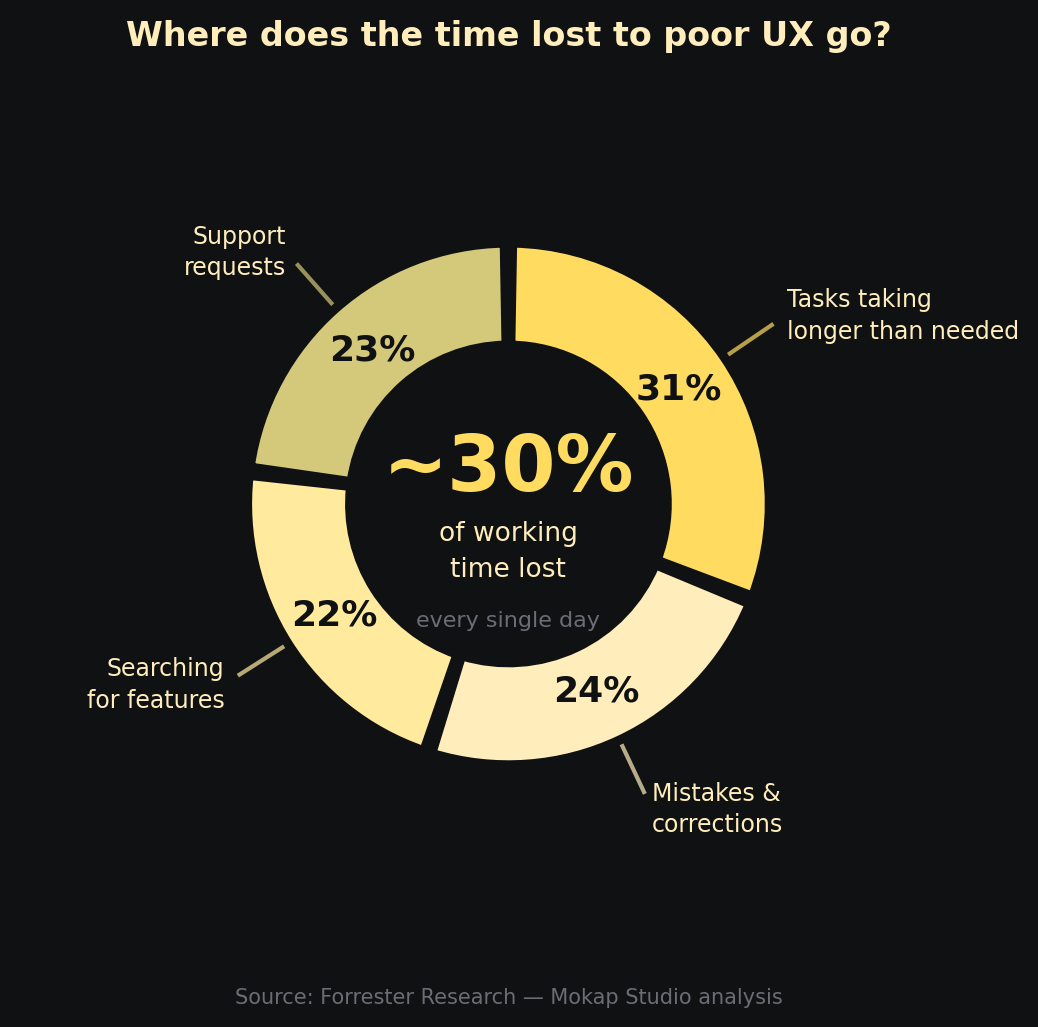
How operational time lost to poor UX is distributed — based on Forrester Research data
Error handling that doesn't help users recover
Errors happen — in any software. The difference between a good and a poor user experience isn't the absence of errors, but how the system responds when something goes wrong.
The worst pattern is a technical message combined with no guidance on how to proceed: "Error 500 — Internal Server Error", or "Operation failed" with no further explanation. The user doesn't know if their data was saved, whether to try again, or who to contact. The situation usually resolves itself with a call to IT or a hopeful page refresh.
A good error message does three things: explains what happened in plain language, confirms whether the data is safe, and suggests a concrete action to move forward. This isn't a copywriting problem — it's a design problem about handling critical moments in the experience.
Designed for the demo, not for daily use
This is perhaps the most insidious mistake. A software application can look extraordinary during a sales demo — clean, modern, fast. And then reveal itself as gruelling after three weeks of daily use.
The demo always shows the happy path: perfect data, linear flow, zero ambiguity. Real work is made of exceptions, incomplete data, interrupted and resumed tasks, shifting contexts. A design optimised for the presentation tends to favour immediate visual impact over useful information density, animations over perceived speed, aesthetic minimalism over functional completeness.
For someone who uses the software an hour a week, a clean and simplified interface is perfectly fine. For someone who uses it eight hours a day, productivity always beats aesthetics. Professionals prefer a dense but navigable interface over a beautiful but hollow one. Designing for real work means talking to the people who actually do that work — not to the people who present it.
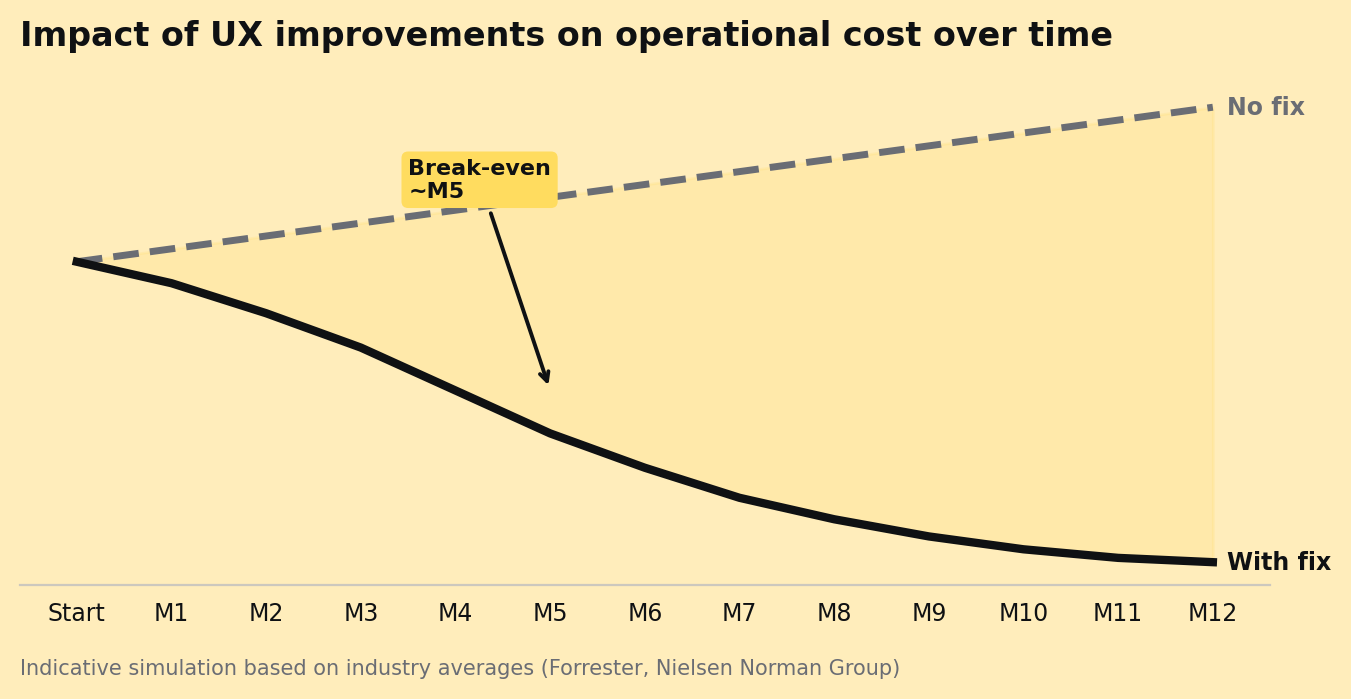
Simulated impact on operational cost after targeted UX interventions — indicative data from Forrester and Nielsen Norman Group
The best software is the kind that disappears: it does its job without the user ever having to think about it.
What to do with this list
Spotting these mistakes doesn't require a formal audit. It just takes observing people using the software in their real context — not in a guided test session, but during an ordinary working day. Where do they get stuck? Where do they ask for help? Where do they open Excel alongside the tool because it doesn't give them what they need?
Those moments of friction are data. And every friction point removed translates into recovered time, avoided errors, better adoption — and, often, a measurable reduction in support requests.
The UX of a software application isn't a cost to contain: it's an efficiency multiplier that acts on every person, every day, every operation. Investing in design means investing in the way your team works — and in how well they can do it.
If you're assessing the UX of an existing digital product or building a new application, the starting point is always the same: observe first, design second. The most important answers are already there, in the everyday gestures of the people who use the system.