Internal tools: the design system nobody builds
Companies pour millions into the design of their public website, while internal tools remain a patchwork of inconsistent interfaces. And yet that's where the team spends eight hours a day.
- Published on
- 21/05/2026
- Reading Time
- 9 min
- Written by
- Flaviano Arbia
Open the public website of any mid-market company. It's polished: thoughtful typography, a coherent palette, fluid micro-interactions. Behind it sits a documented design system, a dedicated team, an annual budget.
Now step inside that same company and open one of the tools the team uses every day — the order portal, the custom CRM, the operational dashboard, the warehouse admin, the HR app for time off and expenses. Each interface looks like it was designed by a different person, in a different year, following different logic.
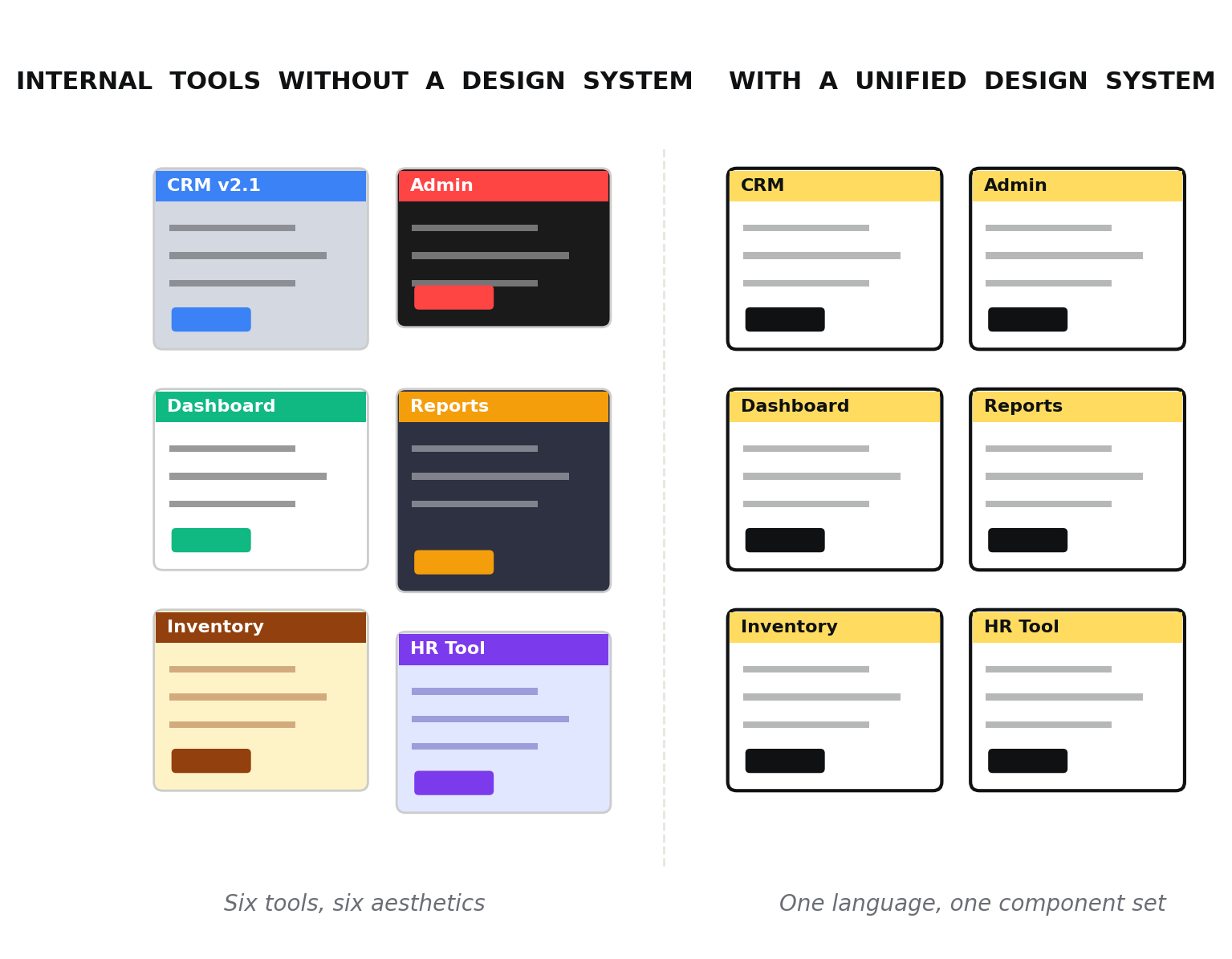
The visual difference between six internal applications grown separately and the same six unified under a shared design system.
This isn't an isolated case. It's the norm. The design system nobody builds is the inward-facing one — and ironically, it's the one with the biggest impact on real productivity.
Customers see the public website for ten seconds. Employees use internal tools for eight hours a day.
The design budget paradox
In nearly every company — from a growing SMB to a tech scale-up — design is treated as a marketing tool. Investment goes where customers are won: homepages, landing pages, consumer apps, brand identity. All perfectly reasonable, but the budget runs out before reaching half the organization.
When you get to the ERPs, the admin panels, the operational tools, the logic flips: "it works, doesn't it? Why spend on it?" It's the same shortsightedness that leads a company to buy a four-thousand-euro espresso machine for reception and leave employees with a broken pod machine in the kitchen.
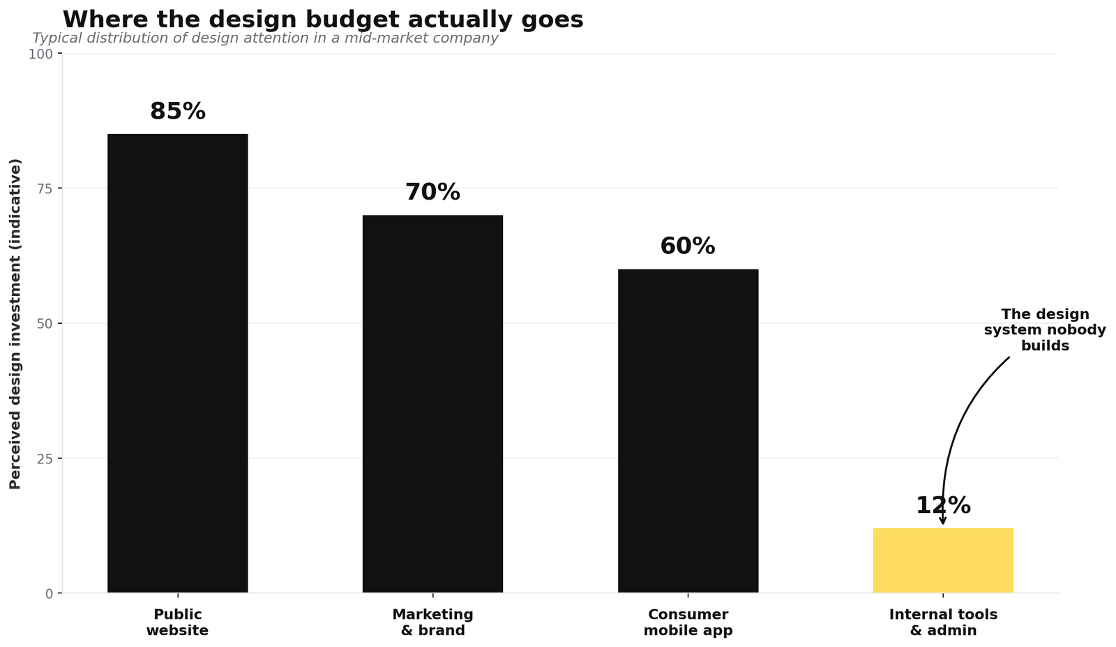
Internal tools receive on average less than 15% of the design attention given to the public site, despite being where employees spend most of their time.
The problem isn't just aesthetic. When every internal tool speaks a different visual and interaction language, specific things happen: onboarding for a new hire stretches by weeks, because each application has to be learned from scratch. Operational errors increase, because the same action follows different patterns depending on context. And maintenance costs explode, because every small change has to be replicated five times in five different ways.
Why internal tools turn into a patchwork
Understanding how the chaos sets in helps avoid it. The story is almost always the same, and unfolds in three phases.
Phase 1 — The eternal MVP
The first internal tool is built to solve a specific problem: managing orders, tracking tickets, monitoring production. It gets shipped fast, using whatever framework the developer happens to know, with default Bootstrap or Material UI components. It works, and that's enough.
Phase 2 — Proliferation
Six months later, another tool is needed. A different developer builds it (or the same one with a different trendy library). Then a third, perhaps outsourced, perhaps based on a purchased template. Each tool is internally consistent but completely misaligned with the others. No one is "responsible" for the overall look because, well, there is no overall look.
Phase 3 — Paralysis
Three years in, the company has seven or eight internal applications, all grown in parallel, all business-critical. Changing even the color of a button means touching them one by one. Designers — when there are any — avoid these projects because every intervention turns into a mini rewrite. Design debt becomes indistinguishable from technical debt.
Internal-tool design debt is invisible on the balance sheet, but you pay interest every day in time, errors, and turnover.
What to learn from those who solved it
The good news is that some of the world's strongest design systems were born exactly out of this problem. They didn't start from the public website — they started from a company that looked inward and said "this can't continue."
Shopify Polaris is the purest example. It launched in 2017 to bring consistency to the merchant admin — the panel hundreds of thousands of merchants use to manage orders, products, customers. It's an inside-out tool: Shopify employees use it for support, merchants use it eight hours a day. Every choice is optimized for data-dense, workflow-heavy interfaces. Its resource lists and index tables have become a reference for anyone building admin dashboards.
IBM Carbon takes a different philosophy: governing the complexity of a vast and varied enterprise software portfolio. Its strength lies in design token architecture — a system that lets the same visual coherence apply across technically very different products, from cloud to machine learning. Carbon is also a benchmark for accessibility: its components are designed to meet WCAG AAA standards, which is the level required in many enterprise and government contexts.
Atlassian Design System holds together a universe of products — Jira, Confluence, Bitbucket, Trello — that share a DNA of collaboration and productivity. Its inline editing, drag & drop, and state-management patterns are particularly refined because they come from products that live on continuous micro-interactions.
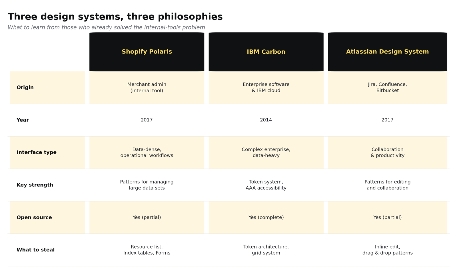
Three different approaches to the same problem: bringing coherence to complex operational interfaces.
The shared lesson, beyond the differences, is this: none of these systems was born from marketing. They came from the operational need to stabilize the interfaces a business uses to generate value. And precisely for that reason, they're far more useful to study — for anyone building an internal design system — than any public-facing system.
The real cost of inconsistency
Quantifying the cost of poorly-designed internal tools is hard, because it hides in a thousand small inefficiencies. But once you start adding them up, the number becomes meaningful.
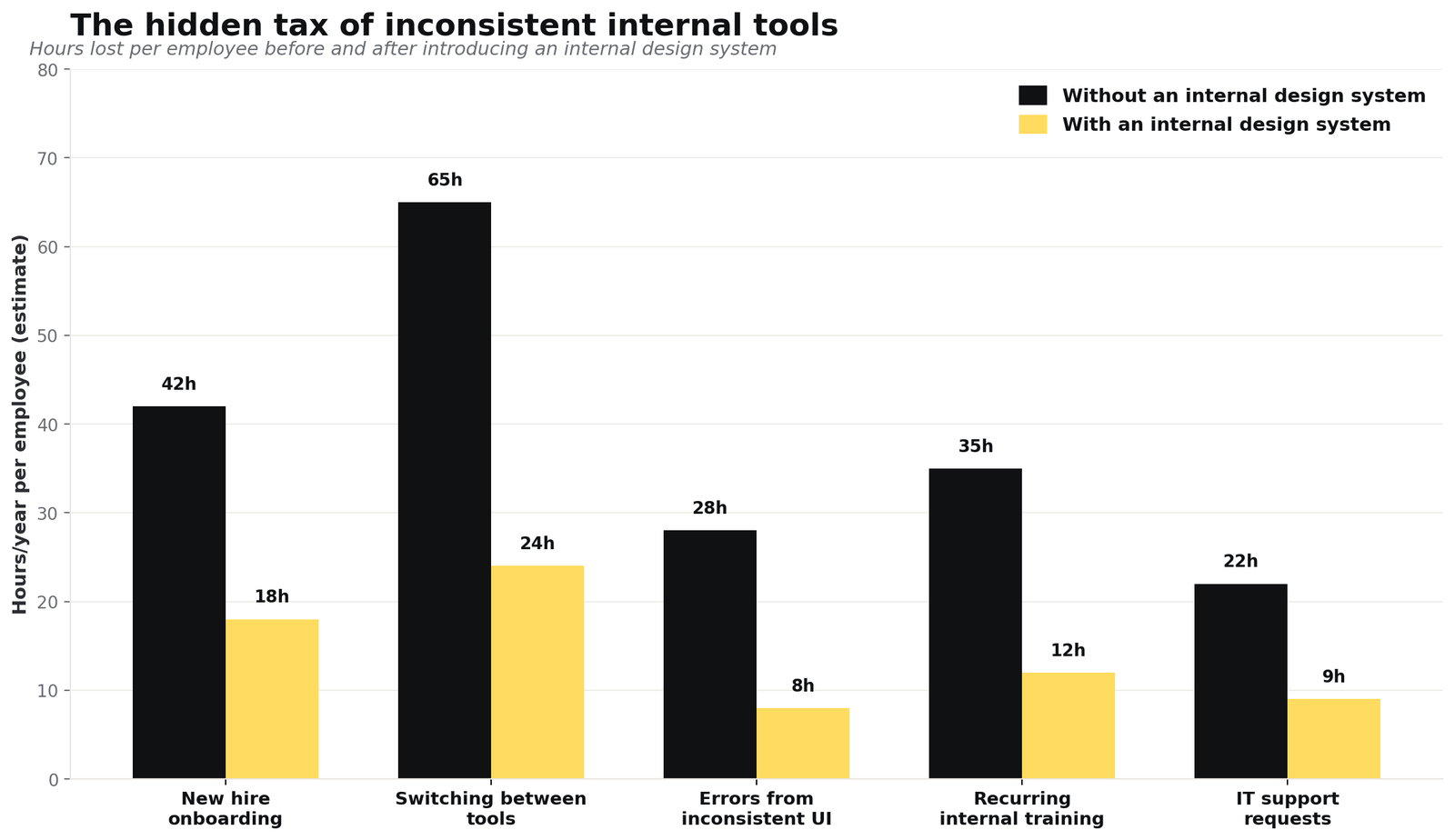
Estimated hours per employee per year recoverable across five areas after introducing a coherent internal design system.
The five most relevant hidden costs are these.
Onboarding. A new hire has to learn five tools with five different patterns. Each tool requires between six and twelve hours of effective training in the first three months. With a shared design system, the pattern is learned once and transfers everywhere.
Context switching. When an operator moves from CRM to ERP to ticket portal, every context shift costs attention. If those three tools have different layouts, navigation, and language, the cognitive cost multiplies. Research by NN/g on internal and external consistency has documented this for decades.
Operational errors. When the same button (Save, Confirm, Submit) has different colors and positions in different tools, errors increase. It's a textbook violation of the least astonishment principle.
Recurring training. Every new feature in an inconsistent tool requires dedicated training, because there's no way to learn it by analogy with the rest of the system.
IT load. An ambiguous interface generates support tickets. Tickets that, in many organizations, are the most underestimated cost line of all.
How to actually build it (without making another public website)
A design system for internal tools has different priorities from a consumer-facing one. It shouldn't impress — it should disappear. It shouldn't tell the brand story — it should make the brand work. Here are seven operational principles that hold up in practice.
- Start from workflows, not components. Map the three or four most frequent operational workflows before even thinking about buttons. The design system serves those.
- Density first. Internal tools show a lot of data in little space. The generous padding of consumer design is an enemy here. Study Polaris and Linear, not Stripe.
- Tokens, always. Colors, spacing, typography in tokens, never as hardcoded values. It's the only insurance policy against a future rebrand.
- State patterns, not just components. Loading, empty, error, success: define them once and replicate them everywhere. That's where real consistency shows.
- Minimal but living documentation. No 200-page Figma file no one opens. A Storybook library with real examples, navigable by developers.
- Accessibility by default. Contrast, keyboard navigation, screen readers. Not for compliance — because in operations there's always someone with a non-standard setup, and losing that person is a huge cost.
- Versioned like code. The design system is a product, not a document. It has a roadmap, a changelog, managed breaking changes.
Where to start Monday morning
Building a complete internal design system is a six-to-twelve-month project. But the first concrete step can happen in a week — and it's worth doing before asking for budget or planning roadmaps.
Visual inventory. Open every internal tool and screenshot the same five things across the board: the login page, a table, a form, a modal, an error notification. Lay them side by side. What you see will be more convincing than any slide.
Map the duplicate patterns. Count how many different variants exist for the same three actions: save, delete, filter. Each variant is design debt.
Pilot on one tool. Pick the most-used application and start there. Not the newest or most visible — the one that, if improved, saves the most hours per day. Extract the tokens, build the first component library, then propagate it.
You don't sell an internal design system to the company with a slide deck. You sell it with a before/after side by side, and the number of hours the operations team gets back in the first three months. It's the least glamorous of design projects, and probably the most profitable.
The best internal design system is the one the team stops noticing. It just works.