UX is not aesthetics: how much does a bad user experience really cost?
Your interface is driving customers away without you knowing. And it's not a metaphor: it's a measurable problem, in dollars, every month.
- Published on
- 06/05/2026
- Reading Time
- 9 min
- Written by
- Flaviano Arbia
There's a misunderstanding that keeps costing companies millions, and it doesn't involve designers: it involves the people who sign the budgets. The idea, still surprisingly common, is that User Experience is "the way a website looks". A matter of taste. Color palettes, well-chosen fonts, smooth animations. Something to take care of later, once the product works and there's time to "make it prettier".
It's a misunderstanding with concrete consequences on the P&L. Because UX is not aesthetics: it's the system of decisions that determines how many users complete a purchase, how many abandon a cart halfway through, how many call customer service because they don't know where to click. It's, literally, a function of revenue.
And when it works badly, it loses money silently, consistently, and almost always invisibly to anyone watching only marketing metrics.
UX is not the dress of the product. It is the product, from the point of view of those who use it.
Drop-off: the bleed you don't see
Every digital interface has a funnel. The user enters from one side (an ad, a search, a link) and should exit the other having completed an action: a purchase, a sign-up, a quote request. Between the two ends of the funnel, however, there are points where people simply disappear. It's called drop-off, and it's the most underestimated metric in digital marketing.
The Baymard Institute, which has been studying user behavior in e-commerce for over a decade, calculates an average cart abandonment rate of around 70.19%, an average based on 49 independent studies collected between 2006 and 2023. That means that, out of every ten people who chose a product and added it to the cart, seven stop before completing the purchase.
The causes Baymard has identified over the years are almost always the same, and almost always avoidable: shipping costs revealed too late, mandatory account creation, checkout processes that are too long or fragmented, lack of transparency on delivery times, form validation errors that don't explain what went wrong. None of these problems have to do with how "pretty" the site is. They have to do with how much it respects the time, expectations, and patience of the people using it.
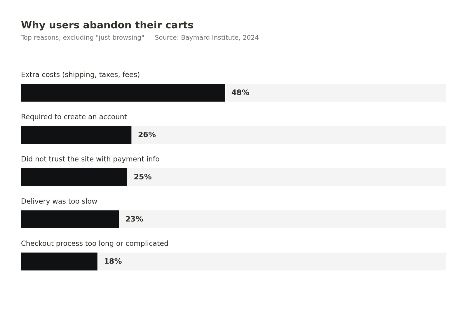
Original chart based on Baymard Institute data, 2024 — free to redistribute with source citation
UX errors that eat conversion
t's worth describing them precisely, because those who don't know them tend to underestimate them.
Poorly designed forms. A field asking for a phone number but not specifying whether it wants the country code, a password requiring eight secret criteria revealed only after the first error, an address rejected because it's missing a hyphen. Every friction point of this kind is a moment where the user can decide it's not worth it. They won't tell anyone. They'll just close the tab.
Ambiguous or invisible CTAs. A "Call To Action" using generic language ("Continue", "Next") without saying what will happen next. A button that doesn't look like a button. A visual hierarchy putting the primary button on the same level as three secondary links. If the user has to stop and think which action to take, you've already lost them halfway.
Lack of feedback. The user clicks and nothing visible happens. For two seconds. Three. Five. They think the site is broken, refresh, try again. Maybe the order gets sent twice. Maybe, frustrated, they leave. An interface that doesn't constantly communicate what it's doing is an interface that generates anxiety, and anxiety doesn't convert.
Performance and load times. Google has published recurring data on this: the probability of a mobile page being abandoned grows sharply as load times increase. Between one and three seconds, bounce probability increases by 32%; between one and five seconds, by 90%. Speed is UX. Speed is revenue.
Between 1 and 3 seconds of load time, the probability of a user leaving grows by 32%.
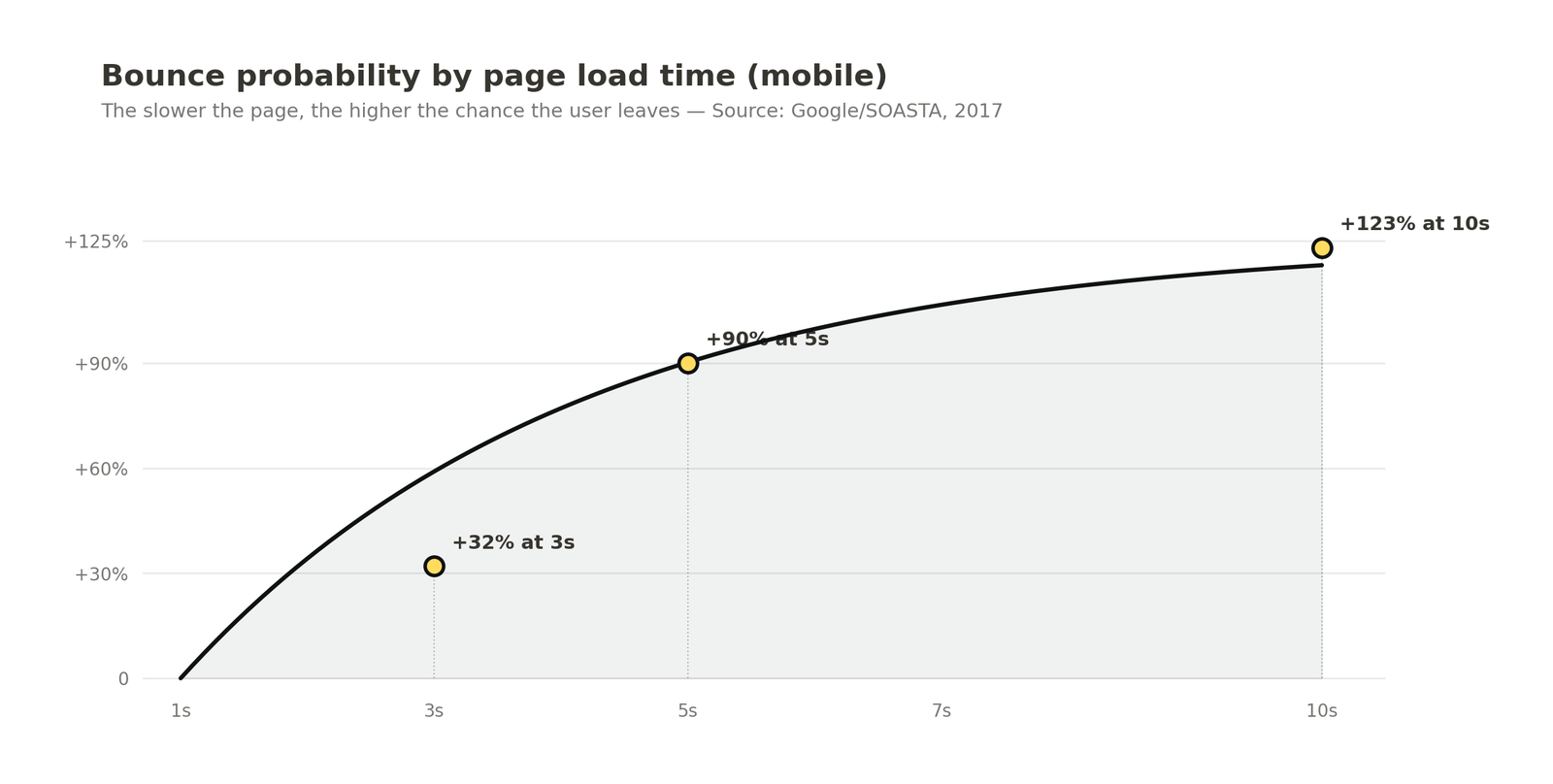
Original chart based on Google/SOASTA Research data — free to redistribute with source citation
Mobile treated as an afterthought. A huge percentage of traffic today is mobile, yet there are still sites where buttons are too small for fingers, forms don't adapt to the virtual keyboard, the menu covers the content. Every time a mobile user has to zoom in to read or retry a tap because the target is tiny, they're running a cost-benefit calculation. And more and more often, that calculation comes out as "not worth it".
Confusing information architecture. The user can't find what they're looking for. Navigation uses internal company terms instead of customer language. The internal search returns irrelevant results. Overlapping categories, filters that don't work together. When the user can't find the product, they're not weighing your options: they're already on a competitor's site.
The cost: numbers, not gut feelings
This is where the conversation usually gets interesting for anyone managing a budget. Baymard Institute also estimates that, through better checkout design, an average large e-commerce site can achieve a conversion rate increase of 35.26%. Translated to the combined US and EU market, that's roughly $260 billion in recoverable orders — money left on the table purely because of interface decisions.
The reverse calculation is even more concrete. Take an e-commerce site doing $1M/month with a 2% conversion rate. If you could reduce checkout abandonment by even five percentage points — through guest checkout, better form validation, shipping costs shown upfront — the additional annual revenue would often exceed the entire budget allocated to redesigning the site.
Amazon is the classic case, by now overused but still useful: internal estimates released years ago indicated that every 100 milliseconds of additional latency cost the company 1% in sales. Walmart reported that every second gained in load time increased conversion by 2%. ING, the Dutch bank, published significant results after redesigning its mobile banking app focusing on reducing the steps needed to perform the most frequent operations.
For every second gained in load time, Walmart saw conversion grow by 2%.
On the other side of the spectrum there's a less-cited but equally real cost: the support cost. Every user who calls customer service because they can't figure out something that should be obvious represents an operational cost that could have been avoided upstream, with a better design decision. The most mature SaaS companies track this explicitly: support ticket volume is a UX metric, not just an operational one.
And then there's the reputational cost, the hardest to quantify. A frustrated user doesn't ask for a refund: they simply don't come back. And maybe they tell someone else. Review platforms are full of one-star ratings that don't talk about the product, but about the experience of getting it. That damage doesn't show up on any analytics dashboard, but it erodes customer lifetime value continuously.
What actually makes the difference
Companies that treat UX as a strategic function — not as a coat of paint — share some recognizable attitudes.
They measure. They don't just look at how many users convert: they look at where they get stuck, what they click by mistake, how long they spend stuck on a field. Tools like heatmaps, session recording, and funnel analysis aren't specialist curiosities: they're the sensors telling the company where it's losing money.
They test with real people. Five real users trying to complete a task on a prototype reveal, in a few hours, problems no internal meeting would ever have surfaced. Jakob Nielsen's classic study showed that just five users are enough to catch about 85% of an interface's usability problems. Usability testing isn't a luxury for big companies: it's the cheapest thing a small company can do to avoid launching products no one can use.
They iterate on friction points. They don't redesign everything from scratch every two years. They identify the single funnel step where they lose the most people, fix it, measure the result, move to the next. It's less glamorous work than a rebrand, but it's the work that moves metrics.
They treat copy, performance, and accessibility as UX. The words you use on a button, the time it takes a page to load, whether a screen reader can understand the structure of the site: all of this is user experience. All of this affects who buys and who walks away.
The point
When someone says "our site needs to be redone because it's ugly", almost always the problem isn't that it's ugly. It's that it works badly. People don't abandon a site because the blue isn't saturated enough: they abandon it because they don't understand where to click, because the form rejects them, because the final price is different from the one shown on the homepage, because they wait eight seconds and nothing happens.
UX, in this sense, is not the dress of the product. It is the product, from the point of view of those who use it. And a company that keeps treating it as a cosmetic cost instead of a structural investment is choosing, every month, to leave on the table a percentage of revenue that no advertising budget will ever recover.
The most uncomfortable fact is that your competitors, meanwhile, are figuring it out. And every user your site pushes away is a user who, somewhere, is being welcomed better.